Provale Cup
One site serving a family buying a cup and a clinician evaluating a medical device — two audiences who want opposite things.
- Client
- ProvaMed
- Year
- 2026–
- Role
- Design + Development
- Live
- Website
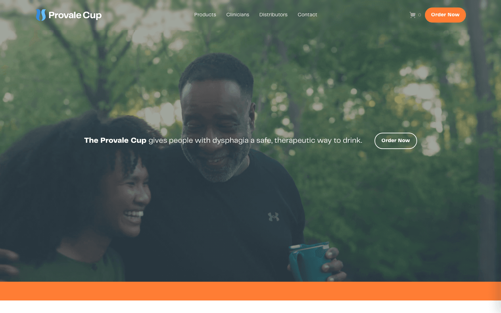
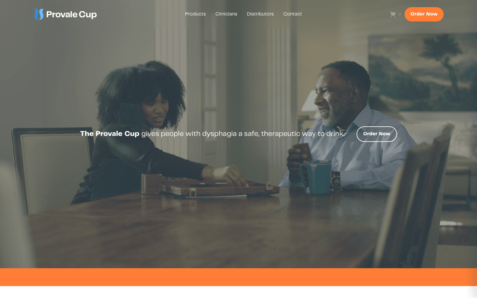
Provale Cup is an FDA-registered drinking cup for people living with dysphagia, difficulty swallowing. It meters liquid into a safe, consistent sip, so drinking doesn't require thickeners — the standard alternative, and one nobody enjoys. We built the commerce and marketing site: Next.js and TypeScript on the front, Sanity for content, Shopify for checkout, and a resource library written for speech-language pathologists rather than shoppers.
Two audiences who want opposite things from the same page
The first visitor is a person with dysphagia, or more often the family member helping them. They arrive worried, they aren't shopping in any leisurely sense, and what they need is to understand quickly what the cup does, whether it fits their situation, and how to get one. Clarity, and a short path to a purchase.
The second is a speech-language pathologist evaluating a device for clinical use. They are not moved by product photography and they are actively put off by marketing language, because in their world a confident claim without evidence behind it is a signal to disengage. They want specifications, indications, instructional material they can hand to a patient, and something they can point a colleague at.
Serve one of them well and you fail the other. A site tuned for conversion reads as thin to a clinician; a site tuned for clinicians reads as a wall to a frightened family. So the build treats them as two entrances into the same building rather than one page trying to split the difference. The split happens in the navigation, early and visibly, so nobody has to scroll through material written for the other one to reach theirs.
Two entrances, one product
The commerce path is short and unambiguous — what the cup does, who it's for, how it works, and a way to buy it. Shopify owns the cart and checkout. The product content, the photography, and the explanation live in Sanity, so the storefront reads as one site even though the transaction happens on somebody else's infrastructure.
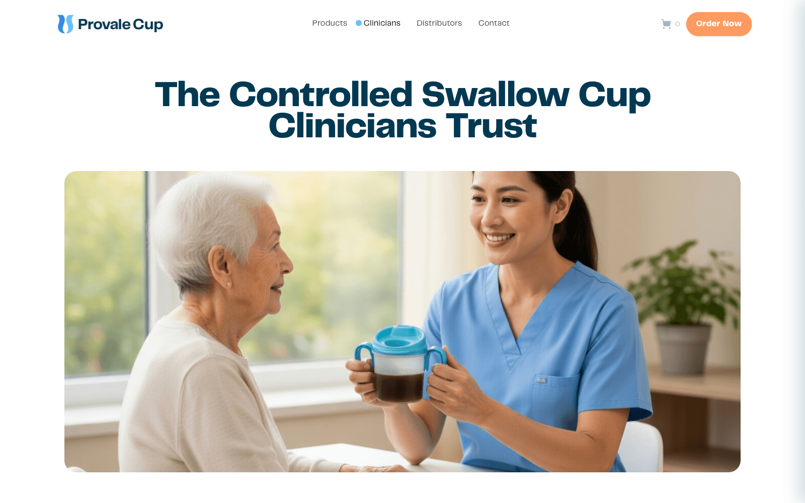
The clinician path is a separate surface with a different voice. A resource library: specifications, instructions for use, care and cleaning, material meant to be printed and handed to a patient. It's built to be scanned by someone hunting one specific fact, not read top to bottom, which means headings that say plainly what's under them and no narrative connective tissue between sections. Anything a clinician might hand to a patient has to survive being printed in black and white on office paper, which quietly rules out a lot of otherwise reasonable layout decisions.
Both are managed from the same Sanity studio, so ProvaMed changes either one without a deploy or a developer. That was a requirement rather than a nicety. A company this size can't have its site gated behind an engineer's calendar, and the resource library in particular is the part most likely to keep growing.
Not rebuilding the cart
There's a persistent pull toward owning the entire experience: custom cart, custom checkout, everything on your own domain, pixel control end to end. It's technically straightforward and it was the wrong call here.
Checkout is not a UI problem. It's tax calculation across jurisdictions, payment failures, fraud rules, chargebacks, address validation, and PCI scope. Building your own cart doesn't just add code — it acquires a compliance surface, one that has to be maintained forever by whoever happens to be on call. For a small medical-device company, that's a liability with no matching upside.
So the split is clean. Shopify owns money and everything that touches it; the site owns content, the clinician library, and the way the product gets explained. The same reasoning covers everything downstream of the sale — order status, refunds, shipping notifications, and the record of who bought what all stay inside Shopify, where there's already an admin the client knows how to operate and a support path that doesn't route through an engineer. The cost is that checkout looks and behaves like Shopify's checkout, and there are a few flows we'd have designed differently. That's a fair price for never being the reason a payment failed or a tax rate was wrong.
Singletons, grouped fields, and a page that can't break
Every page is a Sanity singleton with its fields grouped by section, so an editor opens Home and sees the page's actual structure instead of a flat list of forty fields with names that only make sense to whoever wrote the schema. Grouping is a small thing that decides whether a CMS gets used or worked around. Singletons rather than a generic page type was a deliberate narrowing: these pages are fixed, each one has its own shape, and modeling them as documents an editor could create at will would have bought flexibility nobody asked for at the cost of a studio nobody could navigate.
The part worth stealing is the image fallback. Every image field falls back to a committed path under /public when it's empty. An editor who clears a field, or who saves halfway through swapping artwork, gets the original asset — not a broken image, not a layout that collapses because a src came back undefined. The site's default state is the committed one, and content overrides it.
The principle underneath is that an empty field is a normal condition, not an error. Any CMS-backed page where a missing value can render a broken page will eventually render a broken page, usually on a Friday, usually on the page that matters most.
Writing carefully about a medical device
The copy is a constraint, not a creative brief. Claims about a registered medical device have to be accurate and have to stay inside what the device is actually for, and the line between describing a product and giving medical advice is easier to cross than it looks — especially when the honest, helpful instinct is to answer the question a worried visitor is really asking.
So the site describes what the cup does and who it's for, points to the clinician resources for anything past that, and consistently sends clinical judgment back to a clinician. Writing that way means deleting sentences that would have converted better. Being the site that overstated what a swallowing device can do is not a trade worth making.
It runs on Next.js and Tailwind, with every page editable by the client in Sanity, live at provalecups.com.
Field notes
- Don't rebuild the cart: commerce as the start of the pipelineTwo commerce builds, one decision in common: keep checkout on Shopify. What differed was everything that happened before and after it.
- What a CMS handover should actually includeA training call is not a handover. The person who attends it is usually not the person editing the site a year later.