Construction project management — a Next.js dashboard, an Expo field app for crews, Stripe and ACH payments, and a Python OCR service that reads supplier invoices.
AI aimed at one expensive process at a time — reading documents, answering from your own material, turning sessions into notes — with a person on the result. Advisory if you're deciding where to start, engineering if you already know.
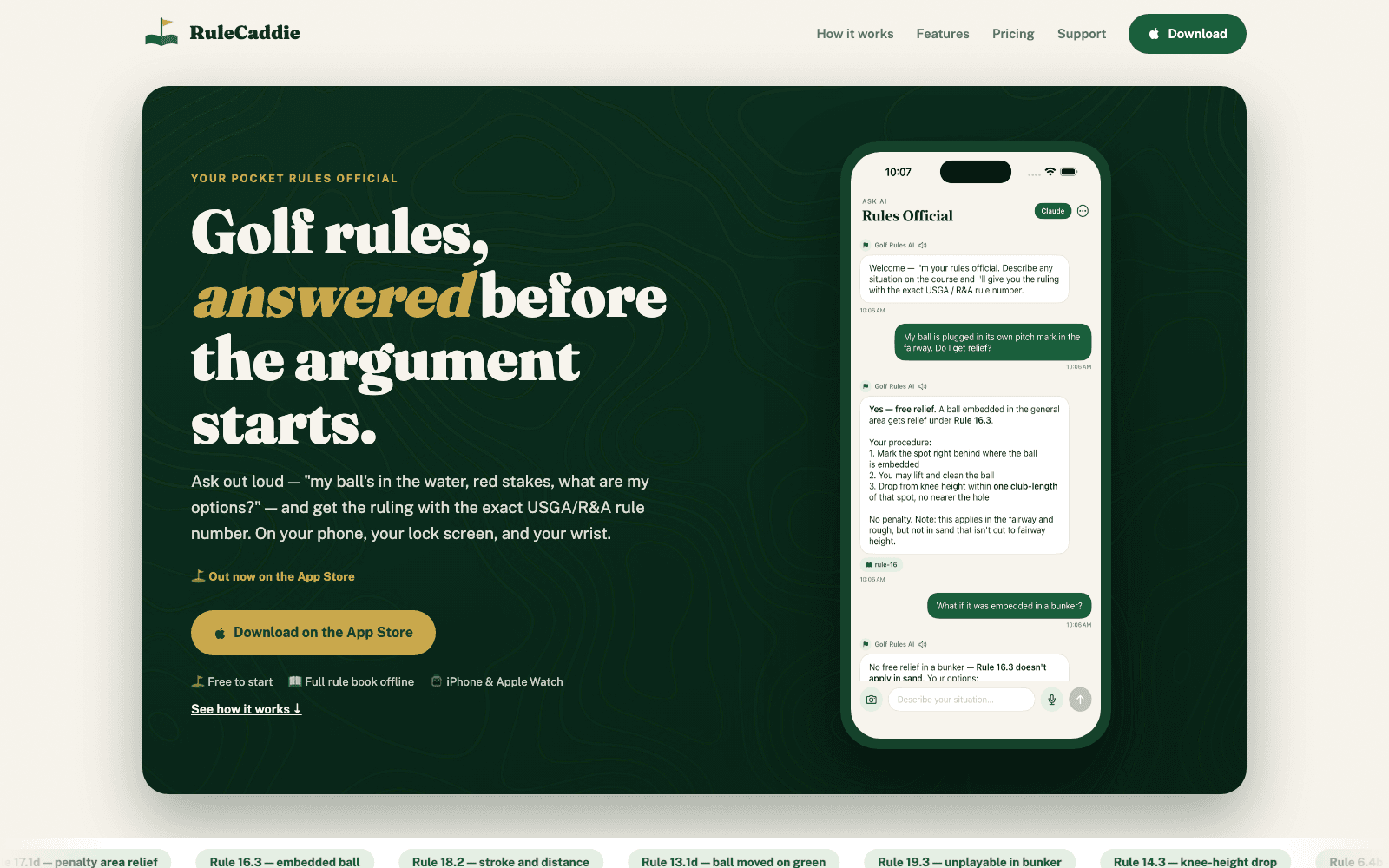
A golf rules assistant that cites the rule it answered from. The number is attached by the retrieval layer rather than written by the model, so a fabricated citation stops being something that can happen.
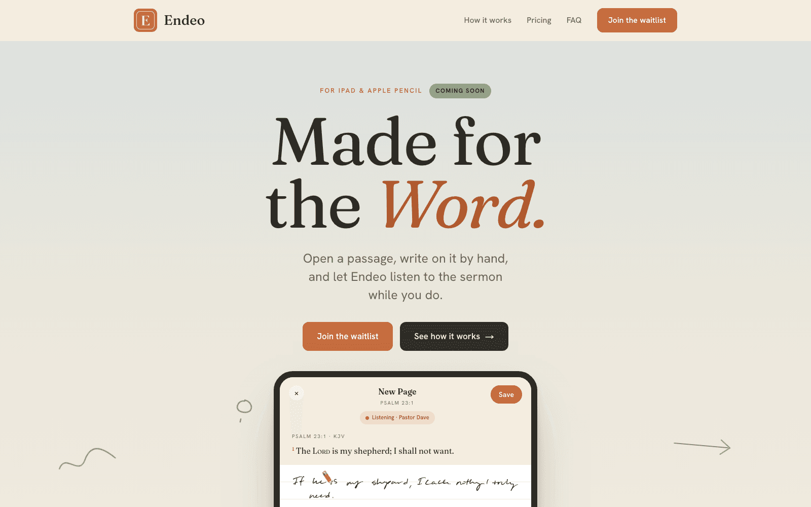
Apple Pencil handwriting turned into text and live sessions transcribed and summarized; AI answers grounded in the official Rules of Golf, with an offline database for when the signal drops.
The unglamorous software that decides whether a week takes four hours or forty. Usually document-heavy, usually replacing a spreadsheet and a lot of re-keying.
Purchase orders arrive as PDFs, get parsed into line items, matched against manufacturer price files, and go back out as vendor confirmations — with a human in the loop where it counts.
A construction platform that had to work in the office and on a jobsite with one bar of signal.
The problem
A builder's software has to serve people whose jobs have almost nothing in common. The office needs invoicing, change orders, subcontractor payments, RFIs, submittals, and budget tracking — dense, detail-heavy screens. The homeowner needs a calm view of progress and a way to approve things without learning construction vocabulary. The field crew needs to photograph a receipt with cold hands and get back to work.
What we built
The web app is the system of record — projects, invoicing, the owner portal, and staff admin, built on Next.js with MongoDB behind it. It owns the API that everything else talks to.
The hard part
Payments were the least forgiving part of the build. Subcontractor payments run through Stripe with both cards and ACH via Financial Connections, and the system carries a second provider as an alternative path — because a payments integration you can't swap is a business risk, not just a technical one.
Handwriting on an iPad, turned into searchable text — and a sermon, transcribed while you take notes on it.
The problem
People who study seriously write by hand. It's slower, and that's the point — it forces you to compress an idea before committing it. But handwritten notes are a dead end: you can't search them, you can't pull a thread across three years of notebooks, and you can't line them up against what the speaker actually said.
What we built
Notes are captured with PencilKit and recognized with Vision's handwriting OCR, so the stroke data stays authoritative and the text is a derived, searchable index of it. You never lose what you actually wrote.
The hard part
The app is used in rooms with bad wifi by people who don't want to make an account before they can write something down. So the offline path isn't a fallback, it's the default: SwiftData caches everything locally, and Supabase auth starts anonymous and upgrades later if the person wants sync.
Purchase orders arrive as PDFs. Staff re-keyed every line by hand, then checked each price against a book that changes quarterly.
The problem
The manual process wasn't just slow, it was silently lossy. A part number mistyped by one character, or a price checked against last quarter's file, produced an order that looked completely normal and went out the door. The mistake surfaced when an invoice didn't match — weeks later, when unwinding it meant a phone call to a customer and a credit.
What we built
A PO is uploaded and run through an AI PDF parser that returns structured line items. Those get normalized, then matched against the manufacturer's price database — both the general catalog and the active price list, which are separate sources with different key fields.
The hard part
Every vendor's PDF is different, and the parser's field naming is non-deterministic — the real part code turns up under a different key depending on the document. Beyond that, the failure modes multiply: the code leads the description instead of sitting in its own column; the code is buried mid-description; OCR turns zeros into the letter O; the part is legitimately all-numeric and looks like a stock number; quantity and price columns are swapped.
A golf rules assistant that cites the rule it's answering from, and still answers when the course has no signal.
The problem
The situation this app exists for is a disagreement. Two players standing over a ball in an awkward place, each half-remembering a rule, neither willing to concede to the other's memory. Nobody in that standoff is persuaded by a confident paragraph from a chatbot. They're persuaded by a rule number they can look up, because it's the only thing in the exchange that isn't somebody's opinion.
What we built
The Rules of Golf is unusually well suited to retrieval, because it already has the structure you would have wanted to impose on it. Numbered rules, sub-rules, lettered clauses, each one a self-contained procedure with a stable identifier. Most retrieval pipelines throw that away and split the source into fixed-size chunks, which slices a procedure in half, strands the heading in whichever chunk happened to catch it, and leaves the model to reattach a number to a passage after the fact.
The hard part
Golf courses have famously bad reception. They're large, wooded, often rural, and frequently built into exactly the terrain that blocks a signal. The place where a rules question occurs is, more often than not, a place with no bars. Treating the network path as the real product and the offline path as a courtesy would have inverted the actual usage.
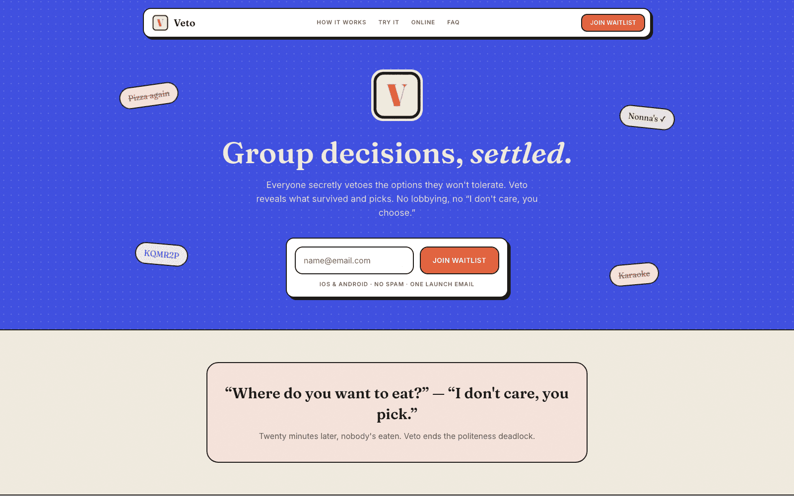
Everyone secretly vetoes what they won't tolerate — and the database, not the app, is what keeps those vetoes secret.
The problem
A poll in a group chat asks what people want, and what comes back is a spread of first choices nobody can turn into a decision. Four options, four votes, and now you're relitigating it. Worse, the format rewards whoever is loudest and quickest — the first reply anchors everyone else, and the person with the strongest opinion about Thai food wins by default.
What we built
With friends, one person hosts a named round and shares a code or an iMessage link. Everyone joins from their own phone and options get added collaboratively in a lobby, which matters more than it sounds — half the value is discovering that somebody already had a suggestion nobody would have volunteered. Then the round moves to the veto step, everyone marks in secret, and the host reveals.
The hard part
Individual vetoes are the sensitive data in this system. If one leaks, the app isn't degraded, it's finished — the whole premise is that you can mark something honestly without it becoming a conversation. So the enforcement lives in the database, where a client bug can't reach it.
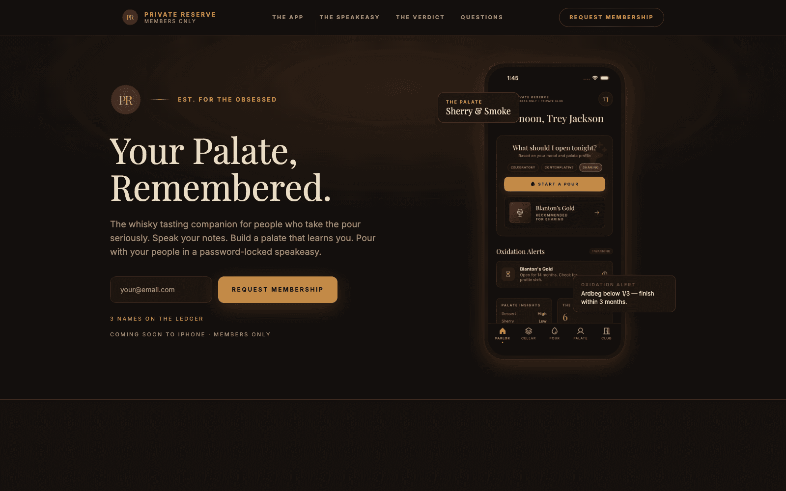
A palate log that has to survive a dark, loud bar — and private club rooms where the verdicts get argued out.
The problem
The context matters more than it seems from a desk. A bar is dark, it's loud, you're standing, one hand is holding a glass, and the person across from you is mid-sentence. You have a few seconds of socially acceptable phone time before you become the person on their phone.
What we built
Capture opens straight into the thing you need: what it is and how it landed. Name the pour, mark the reaction, done — that's a complete entry, and the app treats it as complete rather than nagging about empty fields. Everything else lives on the same screen, further down, optional, reachable without switching modes or opening a second sheet. Nothing blocks on a lookup, either; if a bottle isn't recognized, the name you typed is the name, and it can be reconciled later.
The hard part
Speakeasy rooms are closed groups: a set of people, a shared log of what's being poured, and a place to pin the verdicts worth arguing about. No public feed, no discovery, no followers. That sounds like a smaller version of a social app, and it isn't — it's a different object with a different set of problems.
One site serving a family buying a cup and a clinician evaluating a medical device — two audiences who want opposite things.
The problem
The first visitor is a person with dysphagia, or more often the family member helping them. They arrive worried, they aren't shopping in any leisurely sense, and what they need is to understand quickly what the cup does, whether it fits their situation, and how to get one. Clarity, and a short path to a purchase.
What we built
The commerce path is short and unambiguous — what the cup does, who it's for, how it works, and a way to buy it. Shopify owns the cart and checkout. The product content, the photography, and the explanation live in Sanity, so the storefront reads as one site even though the transaction happens on somebody else's infrastructure.
The hard part
There's a persistent pull toward owning the entire experience: custom cart, custom checkout, everything on your own domain, pixel control end to end. It's technically straightforward and it was the wrong call here.
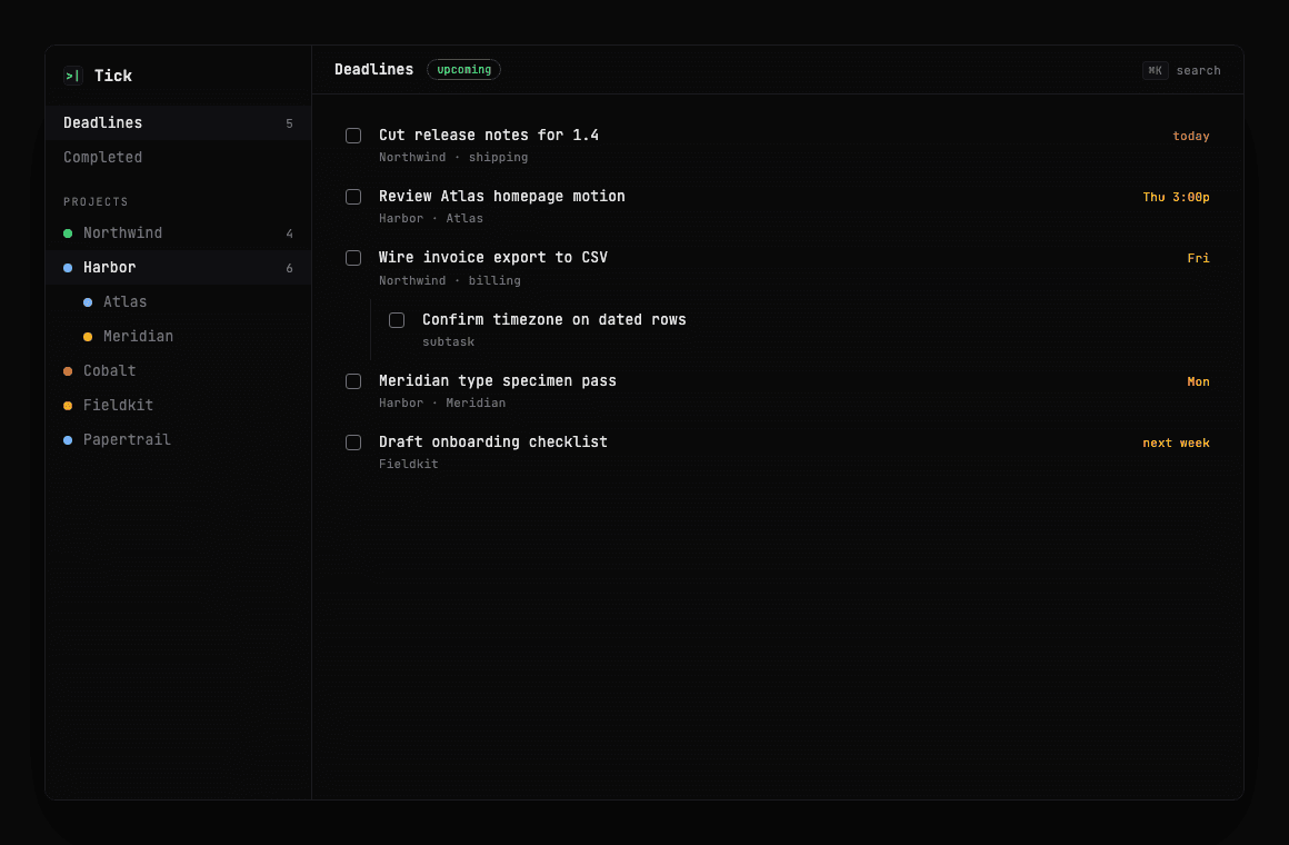
A terminal-flavored Mac checklist that stays local — and an MCP server so your AI tools write to the same SQLite file you do.
The problem
A practice runs on deadlines that don't care which app you prefer. Client platforms, studio sites, App Store builds — they all share one calendar week, and they used to live in three places: a notes file, a chat thread, and whatever task app someone had open that month.
What we built
Tick is an Electron app with a React UI themed like a terminal — monospace, dark panels, accent greens for due state. Projects nest. Todos nest. Deadlines pull across every project into one upcoming view, which is the screen that actually gets looked at during a week.
The hard part
The MCP server is not a second API wrapping a cloud backend. It opens the same SQLite file the desktop app uses. List projects, create a todo, mark complete, pull upcoming deadlines — all of it is the checklist you already see in the window.
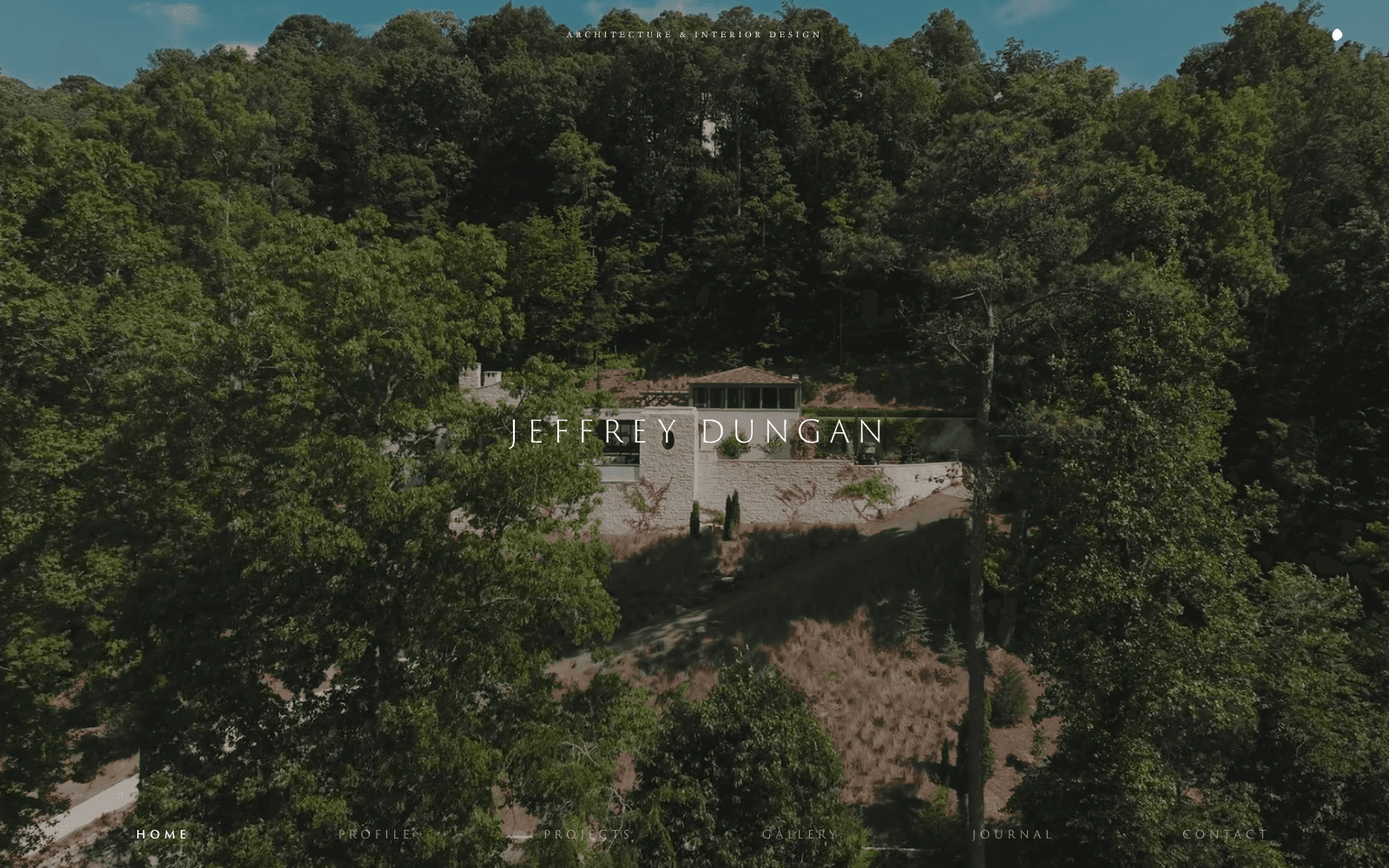
An architecture portfolio that had to feel as considered as the houses.
The brief
Design-studio handoffs fail in predictable ways: hover states that never get built, scroll timing that gets rounded to whatever the library defaults to, captions that wrap differently at every breakpoint because nobody measured the type. For an architecture practice, those aren't polish issues — they're the difference between a site that feels like the work and a site that feels like software about the work.
What we built
The public site is image-forward — project archives, practice pages, and the kind of full-bleed photography residential work demands. Underneath it is WordPress structured so the studio can publish a new house without calling an engineer, without the layout collapsing when a caption runs long or a gallery has eleven images instead of nine.
The craft
GSAP drives the motion. The hard part isn't making something animate — it's making the same sequence feel right when the next project has a different aspect ratio, a longer title, or three fewer photos. Every entrance was tested against the messiest content the archive already had, not against the hero case in the design file.
A calm front for an executive search practice that couldn't look like a job board.
The brief
Executive search sites tend to split into two bad options: stock photography and platitudes, or a dense service menu that reads like a consulting RFP. Redmont needed a third — specific enough that a founder or CHRO recognizes the practice, quiet enough that it doesn't shout.
What we built
WordPress holds the pages so Redmont can update copy and people without a deploy. GSAP handles the entrance motion — enough presence to feel considered, not so much that a busy hiring leader has to wait for the page to finish performing.
The craft
A lot of marketing sites fail after launch because they were built around a blog nobody will write. This one wasn't. The pages are fixed, the claims are durable, and the only recurring job is keeping contact details and practice descriptions current.
A Hill Country land story that had to feel like the place, not a listing site.
The brief
Buyers and guests arrive for a feeling — the land, the light, the pace — long before they fill out a form. A site that leads with lot numbers and a contact widget loses that. A site that only performs atmosphere and hides the next step loses the sale.
What we built
WordPress owns the pages. Vimeo owns the film so large assets don't live in the media library. GSAP drives the scroll storytelling — sequences timed to the design, not to a generic parallax plugin.
The craft
Luxury land sites want every frame at the highest resolution the camera shot. The browser disagrees. The work was to keep the film and stills feeling expensive while staying honest about weight — lazy loading where it doesn't hurt the first impression, Vimeo for video, and Cloudflare in front so repeat visitors aren't re-downloading the ranch.
Explain a freight product without pretending the marketing site is the ops stack.
The brief
Freight software has a real application behind it — rates, carriers, bookings, exceptions. The marketing site's job is narrower: make the offer clear, answer the obvious objections, and get a qualified conversation started.
What we built
The site covers what Shipogre does, who it's for, and how to get started. WordPress so the team can revise positioning without a release cycle. Cloudflare in front for caching and TLS.
The craft
The useful constraint was saying no to scope that looked impressive in a kickoff and expensive forever after — live rate widgets, partial booking flows, and other demos that rot the moment the real product changes an API.